- Toshendra Kumar Sharma
- September 18, 2018
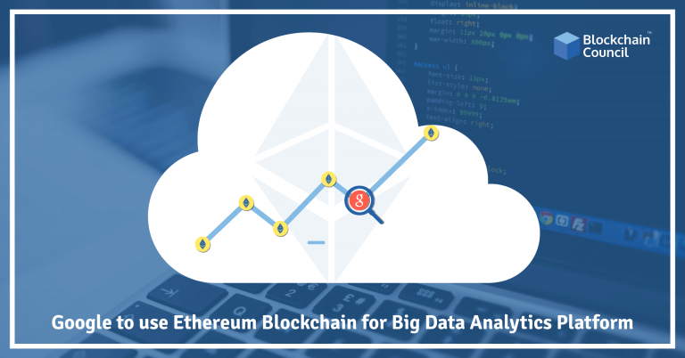
Blockchains are very useful for data scientists as they contain a transparent record of millions of transactions made throughout the world. These transactions can be used to reduce the spending habits of people around the globe to gain insights about behaviour patterns. Google is in the business of big data and therefore develops many tools to sift through vast quantities of data to glean meaningful information. Here’s a look at the new way of visualising the Ethereum blockchain using Google’s BigQuery platform.
Google and Blockchain Analytics
Earlier this year, Google released a Bitcoin dataset for analysis in Google BigQuery data analytics tool. Both Bitcoin and Ethereum are Online Transaction Processing (OLTP) information systems which provide very little analytics features. That’s why Google’s Online analytical processing (OLAP) tools are very useful for exploring the blockchains in any meaningful way. It might seem that the Ethereum dataset would be redundant as blockchains work the same way. However, there are a few fundamental differences between the two blockchains that make it necessary to create different datasets for the two. For instance, the Ethereum blockchain’s primary unit of value is Ether whereas the Bitcoin blockchain utilizes a Bitcoin. The vast majority of transactions on Ethereum, however, are concerned with ERC-20 tokens which are not feasible in Bitcoin. Bitcoin addresses can be used only as wallets which contain balances for the account holders whereas Ethereum addresses can function as wallets as well as other digital assets like smart contracts. Smart contract bytecode allows the programmatic creation of agreements and automatic triggering of their execution in a decentralized fashion. Therefore, it is essential to develop a tool for easy exploration of the Ethereum blockchain because it lacks a number of APIs for easy access to all of the data stored on-chain. Visualizing the blockchain data also allows for checking how the blockchain is being used and seeing how many new real-world transactions are being done via blockchains.
How BigQuery Can Help Visualize Ethereum Blockchain
To demonstrate the power of this new tool, Google provided two concrete examples of this tool in action. The first example is concerned with the relative popularity of most used smart contracts. The query determined the most popular ERC-721 smart contract by transaction count to be the contract for address 0x0601 2c8c f97b ead5 deae 2370 70f9 587f 8e7a 266d. The contract at the address is for the game CryptoKitties which might not be very surprising. The example went on to visualise the CryptoKitty pedigree for accounts that own at least 10 CryptoKitties.
The second example had to do with Transaction Volumes and Transaction Networks. Ethereum is quite popular because of its use as a platform for ERC-20 tokens. The dozens of different tokens on the Ethereum blockchain all have different network usage and patterns of distribution. By looking at each token’s transaction activity, we can measure which are more popular in aggregate or within a given time frame. We can run a query similar to one run above to determine the most popular tokens on the Ethereum Blockchain. By plotting the transaction metrics of OMG, the blog post showed that one of the most popular ERC-20 tokens, OmiseGo had a somewhat unusual pattern of activity on September 13, 2017. The change was characterised by a large increase in the number of OMG receivers but no increase in the number of senders. The reason for this surge in receivers but not in senders was because of the planned OmiseGo airdrop where a portion of the total tokens was distributed to all active Ethereum users. By focusing on a smaller subset of the data, the tool was able to pictorially represent the first 50,000 transactions that had at least two trading partners. In the graphic, nodes (points) represent wallet addresses on the Ethereum blockchain, and edges (lines) represent the aggregate transfer of tokens between a pair of addresses. Edge length is approximately proportional to the number of tokens transferred, meaning wallets that transfer more aggregate tokens between them are closer together in the chart.








 Guides
 News
News Blockchain
 Cryptocurrency
& Digital Assets
 Web3
Web3 Metaverse & NFTs